This goes without saying, but I’ll say it anyway:
SEO is a crucial part of your marketing plan and helps define the success of your business.
But there’s a new(ish) kid on the block to consider too:
UX (user experience).
And it’s become a huge part of SEO. Why? Because it’s a big part of Google’s algorithm for ranking pages.
Recently I did a UX redesign of my digital marketing consultancy website.
I published this redesign on the 1st June 2018. As you can see from the chart below, one month after the UX redesign went live I started to see the impact of this kicking in:

Organic traffic for my site jumped up on 3 August as well. Just look at Ahrefs:

Pretty cool right?
Before we jump into the specifics of what I did, let’s look at UX a little more.
What is UX? (and why it matters for SEO)
UX (or User Experience) is all about how a user experiences a product, which in this case is my website. It’s all about how someone feels when using your product.
In really simple terms: if UX is good, people will come back. If not, they probably won’t.
UX is appearing more and more in the SEO industry right now and is becoming a more fundamental part of SEO.
So why does it matter for SEO?
Because they have the same goal: giving a user what they want.
Not only is it something that should be baked into your site, but it’s something you can do when the obvious SEO things have been done.
Think on-page, link building, content etc. When you’ve done these things and your still struggling to move the needle on your site, there’s a high chance your UX is holding you back.
Don’t let a poor user experience hold your site back.
So how did I increase impressions by 300%
By redesigning my site, specifically focussing on my homepage.
Sounds simple right? It wasn’t.
Before we jump into what I changed and why, we first need to take a step back and briefly consider what makes a good design for UX and SEO:
What makes a good design (for UX & SEO)
Having a design that puts users first and works for both SEO and UX is the key here. Here are a few things to keep in mind when designing a site:
- A responsive site and importantly a good mobile experience
- Focused and inviting to your targeted audience
- Clear instructions and CTAs for what you want users to do.
- Headings to help with reading your content
- A simple navigation and site structure
- A fast loading site
How I redesigned my site for better UX
So before I tell you what I changed to improve the UX, here’s what my site looked like before:

You can also see what it looked like for yourself via the WayBack Machine here.
As you can see, it’s fairly minimal. It tells you what you need to know, that I am a Freelancer and that I do Digital Marketing.
That’s good right?
Not exactly.
So whilst I stand by the simple design, this old design is quite generic. There’s nothing to separate me from the rest of the world of freelance marketers.
We know that branding is good for SEO, but it’s important to position yourself as an expert too in order to get more clients onboard.
Here’s the 3 main things I redesigned on the homepage:
- Home Page CTA
- Hero Image
- The Messaging
Let’s explore them in more detail:
#1 Home page CTA
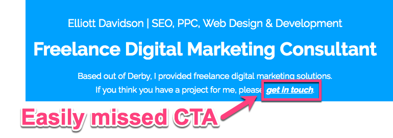
My old site had a CTA that was easy to miss:

What’s more, after reviewing the design and looking at the homepage, I realised there was no clear CTA above the fold.
In case you’re not aware of the term ‘above the fold’ – it is the part of your page that displays on a site without the need to scroll. It’s the most visible and therefore get’s the most attention.
Best practice is to put your CTA above the fold. Something which wasn’t overly clear on my old design. Oops!
So what did I change about the homepage CTA and why?
I kept it simple.
I made the only CTA to get in-touch with me via my contact form. Previously you could contact me via phone too (more on that later).
Then I made sure not to stuff too much above the fold and risk confusing users. I just added in a clear CTA above the fold that read: ‘How can I help you’:

This is instantly more personable and approachable. ‘How can I help you’ reframes the question to being about the client. It’s persuasive copywriting 101.
But did it work?
Did people interact with my homepage more?
Well now 61% of home page clicks are on the header nav bar:

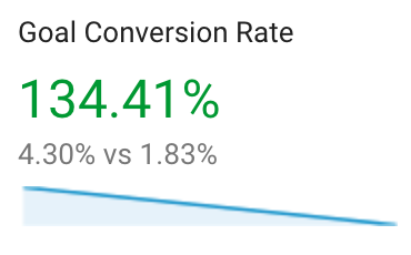
And the new hero CTA’s saw a 4% increase. The site is now driving more relevant traffic and is converting at over double:

I won’t lie: this is not as much as I had hoped for.
But my goal was to drive more lead inquiries and I succeeded. Like I said, this has driven more relevant traffic with more qualified leads. This has also led to 5 figures worth of business from these leads alone.
#2 Hero image
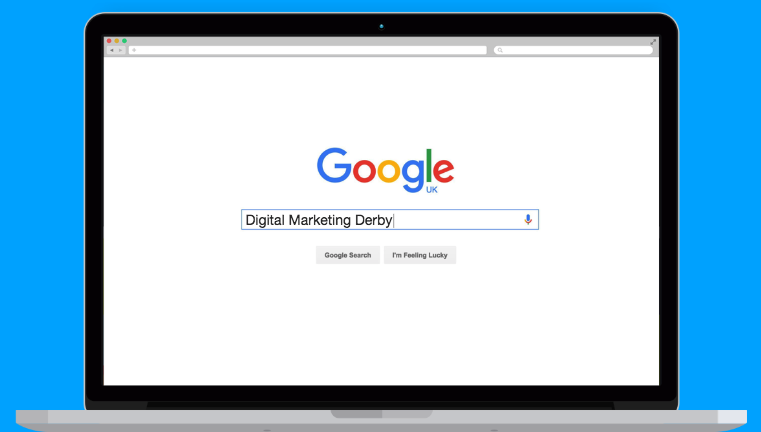
My old site had hero image showing Google search for the service I was providing:

The only problem is, it didn’t actually show me.
I added an image of myself instead of just a laptop showing a Google search. It’s only subtle, because I didn’t want the hero image to distract from my CTA, but I think it adds a nice personal touch:

Why?
Because clients are humans too and they want to work with other humans. Not faceless machines.
Seeing a real person helps to build trust by adding real face to brand. In fact, research shows that human photos positively impacts a visitors first impressions.
When AB testing the conversion rate between a contact button with an icon vs a button with a photo, the version with a human face received 48% more conversions.
People want to connect with other people. Having a photos facilitates that connection and drives people to perform the action you are directing them towards.
Something else that’s very subtle is that I’m looking right at the CTA:

#3 The messaging
I changed the messaging I used to communicate what I did to clients. How many times have you read something like this:

Answer: most digital marketing consultants.
So in order to stand out, this is one of the biggest changes I made. I updated my page copy to talk to my potential clients:

Let’s look into this further.
When it comes to designing pages, it can be easy to neglect the copy. Don’t do this.
The messaging of your page is pivotal to the success of your page. It is what ties your UX and SEO together.
Messaging is just what you want to tell your prospects. You want to tell them something that makes them want to hire you.
Bearing that in mind, here’s what my old design read:
Freelance Digital Marketing Consultant
Based out of Derby, I provided freelance digital marketing solutions.
If you think you have a project for me, please get in touch.
Whilst there is nothing wrong with this, it’s not very specific. It may be more at home on resume, CV or cover letter.
It doesn’t really convey what I could specifically do for a client, and why they should hire me.
With that in mind, here’s what it reads like now:
LET’S TAKE YOUR BUSINESS TO THE NEXT LEVEL…
Smart companies hire me to generate them more sales & leads via digital marketing allowing them to focus on their business.
This acts as more of a direct message to potential clients.
Whilst they may want to hire a digital marketing consultant, a consultant that can take their business to the next level sounds better.
And it wasn’t just the homepage where I updated my messaging.
I updated other elements of my page design, the headings on the case studies & services pages as well as the footer.
Just look at some the more conversational messaging I used:


The thing I learnt doing this is: write your page copy like you are talking directly to a potential client. Because you basically are.
But what about the rest of the site?
While I focused on updating the homepage, I actually made design changes site wide. Sometimes it’s just time for a redesign.
I kept the colour palette around the colour blue. Colour theory suggests that blue signals trust and professionalism, which is exactly the message I want to get across.
So what else did I change?
Here are the other things I changed across the site and why:
1) Case Studies
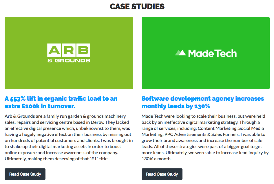
I added case studies for social proof and to increase authority by showing I know what I’m doing:

The case studies really allowed me to demonstrate my credibility.
I can walk a potential customer through the client, problem, strategy and result. This way I can fully explain everything that happened and why.
Case studies are a great sales tool as they not only show your credibility but also help to build trust in your services.
2) Footer contact forms
I removed footer contact forms as they never converted and instead just added a CTA going to the contact page:

This way the design is more minimal and fitting not to mention in keeping with my more friendly and approachable tone.
Another big thing I removed from the footer was the phone number:

I was getting lots of calls from unqualified people and it was taking up a lot of my time.
Not only did I swap my phone number for a CTA, I setup a sales funnel. Here’s a quick rundown of how it works:
- Client gets in touch with me via contact form on my website.
- Then I send them a qualifying email to better understand the project they have in mind (this also establishes their budget).
- From here, if we are a good fit, I’ll have a discovery call with them to better understand their needs.
- Once qualified over email, I’ll now call the potential client.
3) CTAs
I added a CTA to homepage hero section as the old design didn’t have a clear CTA:

It wasn’t just the hero CTA I changed though. I looked all the CTAs across the site.
The biggest change I made was to the footer. In the footer of most pages, previously there was contact form in it.
I removed this due to the fact it never converted. I also didn’t like the fact it looked odd and out of place with the rest of the site.
I kept it on the case studies page as it made sense to do so here.
But I think removing the footer contact form from my contact page was a good move.
I did this because I want people to be focused on filling out the form when on that page. Having footer links and CTAs here seems like a distraction.
4) Photos
I added photos throughout the site to add more personality and so that people could connect with me better:

The previous site didn’t have any direct connection to me: there was no personality.
This is why I had a load of photos taken so people could better feel like they knew me. This way the site wasn’t a faceless entity.
5) Layout change
I changed the page layout into block section to remove sidebar distractions:

Removing the sidebar was an easy decision: the contact form in it never converted as well as the others.
Too many forms is a distraction and it was lowering my conversions.
Also with adding the full width section containers throughout the rest of the site, I kept symmetry across the services pages.
The site design and layout were deliberately very similar to larger agencies sites. I did this to try and emulate their credibility.
This way, potential clients will think that we are both at the same level of skill level.
Wrapping up
Although SEO and UX are completely different approaches, they ultimately have the same goals:
Identify a user’s problem and offer a solution.
Think of it this way: SEO helps people find your website and UX helps keep them there. They both work together for the same goal.
And I guess that’s what I realised.
I was ranking and getting people to my site, but people were dropping off. Don’t make the same mistakes I did. Launch your site with SEO and UX combined.
Not sure where to start? If you’d like to discuss getting similar results for your company, get in touch.
If you have any questions or comments, feel free to leave them below and I’ll get back to you.

Leave a Reply